On the Home Page of the Web Portal you can get a quick overview of your power network right now, as well as your personal energy price.
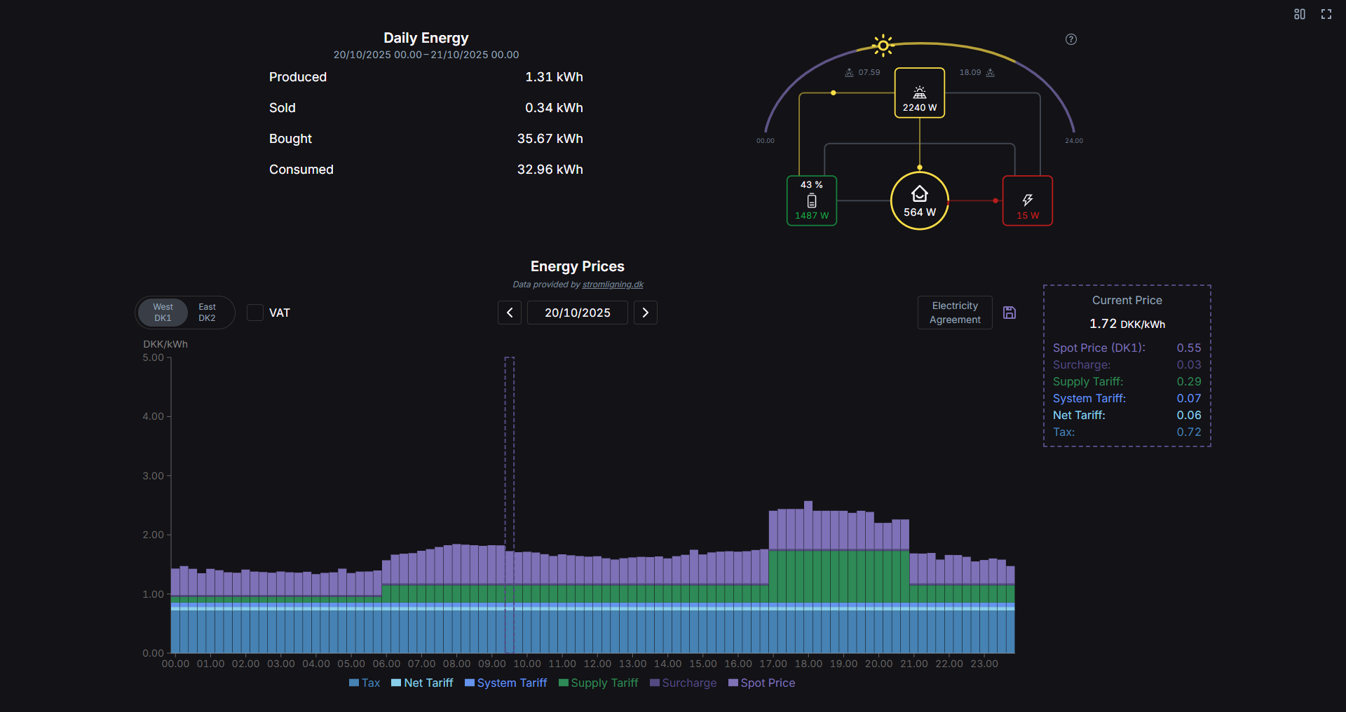
¶ Daily Energy
Here you get a summary of your power data today, from midnight until now.
Produced: The amount of energy that has been produced (from solar panels).
Sold: The amount of energy that has been sold to the grid, either from your solar panels or battery.
Bought: The amount of energy bought from the grid, either to cover consumption or charge your battery.
Consumed: The amount of energy used in the household today.
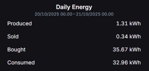
¶ Flow Graphic
This graphic gives you an overview of your system in real time. It shows current values for each entity in numbers as well as how the power flows. This will update every 2 seconds.
-
Solar: The yellow box at the top with the solar panel icon shows how much power your solar panels are currently producing. The colored lines and circles indicate if the power goes to the battery, consumption or is sold to the grid.
-
Battery: The green box on the left with the battery icon shows the current charge of your battery in % as well as the current power value. If the text is green, the battery is currently charging (either from solar panels or grid), and if it is red, it is discharging (either to consumption or grid). The colored lines and circles indicate the power flow.
-
Grid: The red box on the right with the lightning bolt icon shows the current power going to/from the grid. If the text is red, you are currently buying from the grid, and if it is green you are currently selling to the grid. The colored lines and circles indicate where the power goes or comes from.
-
Home: The circle in the center with the house icon represents the current consumption. The colored lines and circles show if the power comes from the battery, solar panels or is bought from the grid. The pie chart is an approximation of the percentage of power coming from each source.
At the top you can see when the sun rises and sets today, as well as how far into the day you are. This data is provided by sunrisesunset.io.
The sun arc can be hidden/shown by clicking the graphic.
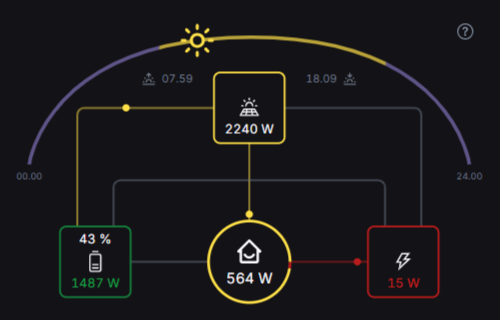
¶ Energy Prices
This chart shows the energy prices for today, and in the box on the right you can see the price right now.
This data is provided by Strømligning.
At the top left you can select your area (if Electricity Agreement is not configured).
In the middle you can change the date.
At the top right you can personalize the prices by selecting your Electricity Agreement. Find your Supplier and Energy Product in the dropdowns and confirm the selection.
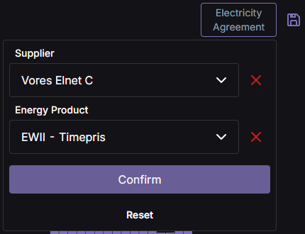
Remember to click the SAVE 💾 icon on the right to save your settings
In the chart itself each bar represents 15 minutes (applicable after October 1st 2025[1]). Each bar is divided into colored sections to show what makes up the total price (DKK/kWh) in each 15 minute chunk. The dashed box surround the current price bar. By hovering over the chart, you can see the price values in numbers.
At the bottom you can see a legend indicating what each color means. You can toggle whether or not to show a specific section by clicking the corresponding item.
¶ Layouts
At the top right of the page you can choose between two different layouts:
- Detailed (default): Shows all the components
- Flow: Only shows the Flow graphic in a larger format
Additionally you can view the Home Page in full screen.
At this date Nord Pool transitioned from hourly prices to a 15-minute resolution. Prices before October 1st 2025 is provided in an hourly resolution. ↩︎